Blacksky Cash
Blacksky Cash is a private, digital payments platform for the Blacksky community, built on the AT Protocol, the open network behind Bluesky.
- Read
- 5 min
- Planted
- 2026.01.26
- Last tended
- 2026.10.13



Overview
Blacksky is a mutual-aid community on the AT Protocol. Its founder had already moved over $250K between neighbors through Papertree. Blacksky Cash brings that into the network: private payments between people, and shared accounts for groups. It runs on Cashu, an open-source ecash protocol for bitcoin, but had to feel as easy as Cash App.
The question
How might we use the social connections already on Blacksky to build community around money, without giving up privacy?
Approach
Context. I immersed myself into the open design space: the AT Protocol, Fedimint, and ecash. I've spent a decade in fintech and am well-versed in susus (rotating savings circles) as an East African in way too many WhatsApp groups.
Principles. Private by default. Familiar patterns (Venmo, Cash App, Wise). Simple governance: few admins, and people release the money.
Audience. Blacksky community members who already help each other: organizers of mutual-aid groups and susus, and the people who chip in.
Mints out of sight
Cashu runs through mints -- the servers that hold the money -- and asks members to choose one at onboarding. The CEO wanted multi-mint support but knew launch only needed one. I designed the multi-mint surface so the future had a home, with single-mint versions beside it. I led with privacy, security, and plain dollar amounts to not deter non-crypto members at the beginning.
Sensible defaults first; advanced choices stay discoverable.
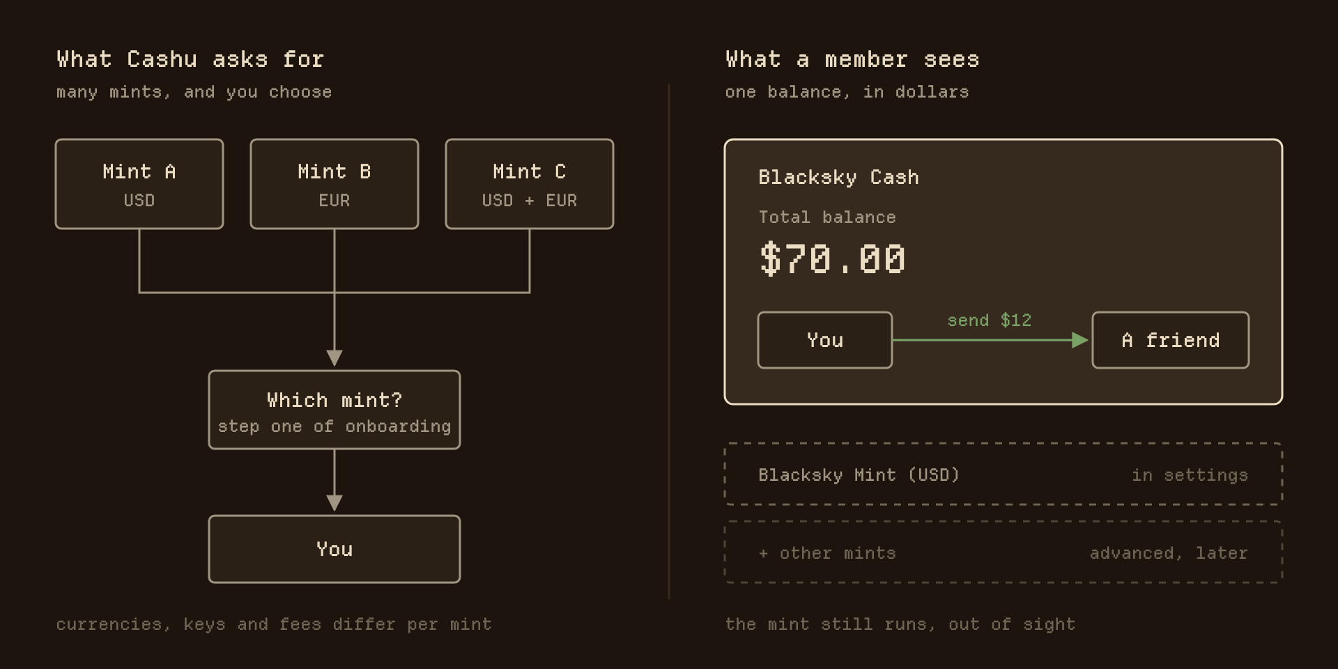
What the protocol asks for, and what a member sees. The mint still runs, in settings.
A separate experience that feels familiar
I wanted Cash inside Blacksky. The team chose a standalone app at blacksky.cash, so I pushed for parity: sign in with your Blacksky account, see the same people and colors, and read a line promising you'll return. A tester said: "Interface mirrors Blacksky, which is helpful. Someone new could be put off going to another website."
A separate app can still feel like home if it keeps the identity people already have.
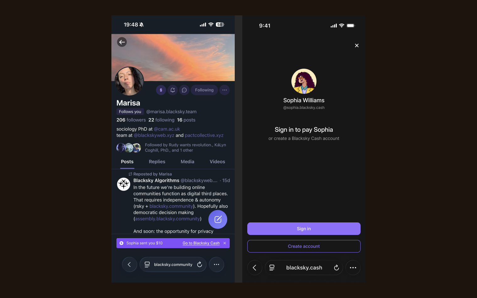
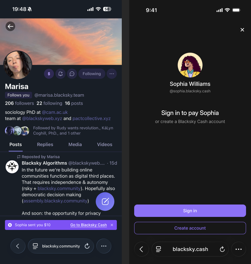
A payment toast on Blacksky opens the Cash sign-in. The address changes; the account and the look carry over.
Three request types, tested down to one
Groups had to move money without stalling or breaking trust. The client wanted three request types at launch: expenses, proposals, and fundraisers. I recommended expenses alone. The CEO wanted all three, to keep Blacksky first to payments on the AT Protocol. I designed them all. Proposals went from several options to Yes, No, or Unsure, with options argued in the chat. A vote still earmarked the money and a second flow paid it out. It tested badly, and I pushed the team to build expenses first.
Every choice you add to money costs trust. When you can't cut the scope, design what's asked and let testing show the cost.
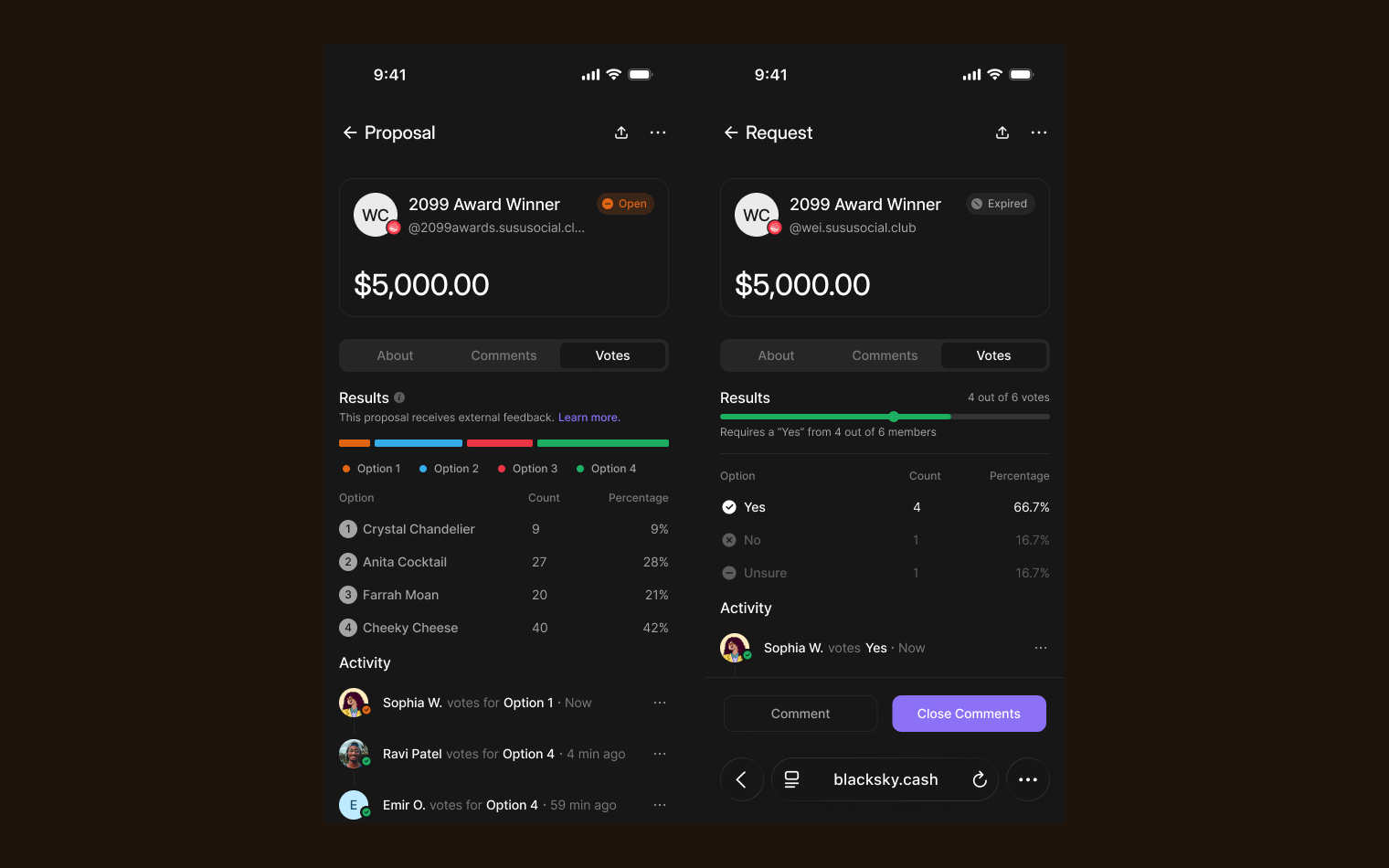
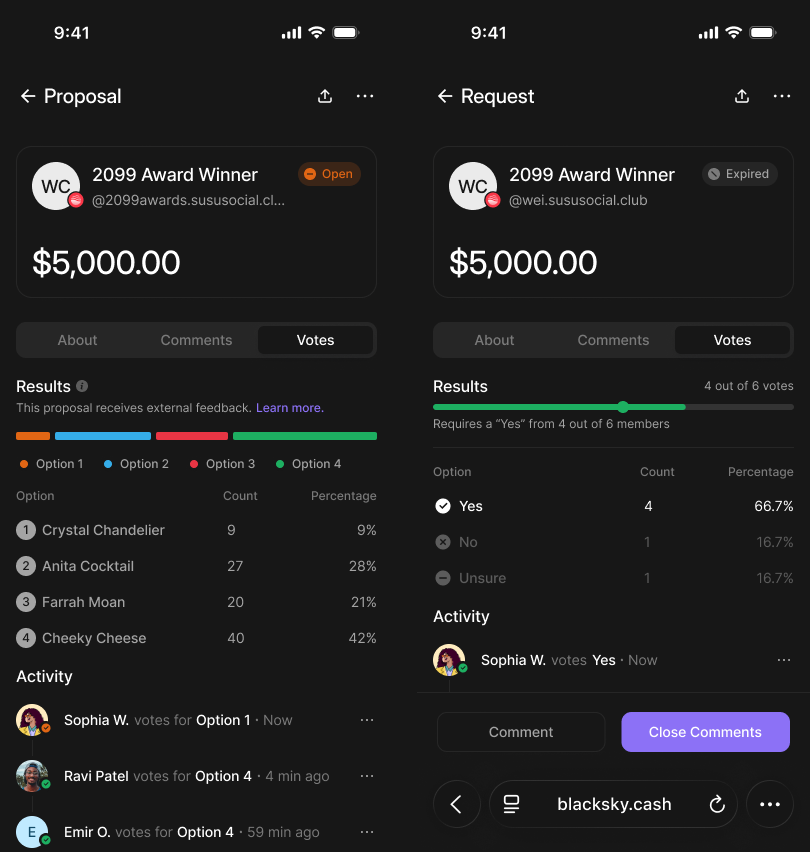
The same proposal before testing (four options) and after (Yes, No, Unsure).
Open-source parts, one palette
I inherited a brand guide but no product design system, and the social app's colors didn't match the guide. The scope moved twice: to a standalone app, then to mobile. I bought Align UI because it sits on Radix, open-source components engineers already use, and I set one palette on top of it. I got the designs ready for handoff; the founding engineer built the demo.
Borrow the parts; own the decisions.
/* Align UI names, the palette I set (dark) */
--primary-base:        #8c71f6;
--bg-white-0:          #171717;  /* "white" is the darkest surface */
--bg-weak-50:          #262626;
--bg-soft-200:         #333333;
--text-strong-950:     #ffffff;
--text-sub-600:        #a3a3a3;
--text-soft-400:       #7b7b7b;
--state-success-base:  #1daf61;
--state-error-base:    #e93544;
--radius-16:           16px;
Align UI's names kept its components working through each scope change.
Takeaways
In January I handed over engineering-ready designs for payments and groups. Blacksky announced Cash that month. Its waitlist page, blacksky.cash, never mentions mints or crypto, and markets the full scope: fundraisers, proposals, voting.
What I'd change: there was no time to research before designing; testing came after the screens. I'd research organizers first.
How the research ran
Goals. The tests aimed at comprehension: does this feel private, do mints make sense, can an organizer run a group? We didn't measure it. The product requirements set launch metrics (accounts set up, payments sent, 30-day retention), which can't be read before launch.
Methods.
- What members had already said. Before I joined, Blacksky ran a pol.is survey: 234 people, 177 statements, 11,289 votes. Paying mutual-aid requests in the app drew 46 agrees to 16 disagrees. Running ads instead of donations drew 6 to 40. Members wanted money to move for mutual aid, not for creator monetization or ads.
- Competitive analysis of Venmo, Cash App, Wise, and Bluesky, and of ecash wallets like Cashu.me and Alby.
- My own ecash study: the Cashu and AT Protocol docs, and bitcoin.design's ecash guide.
- Two rounds of usability tests: peer-to-peer payments in early December, groups in mid-January.
Participants. The Head of Product and the CEO recruited on Blacksky, where they had the social capital to ask. We recruited five members. I spoke with three in the first round and two in the second, including a group organizer.
Sample questions. "Does this feel private?" "Does the concept of mints make sense?" We swapped "I prefer to use crypto" for "I prefer to process payments with someone other than Blacksky" to watch the reaction. For groups, the CEO added: how would you submit a request that isn't about money?
From notes to insights. The Head of Product took notes in each session. Findings went into Figma as comments pinned to the screen under test, so each one sat on its frame, with my action items beside it.
- Mints confused people. A tester needed "more mint" explanation "before moving forward." We took mints out of the tests and buried them in settings.
- Automatic is tough with money. An organizer wanted people, not rules, to release funds, and only two or three admins: "More cooks in the kitchen is bad." We kept human release and small admin teams.
- Some groups must stay hidden. Expenses like bail funds shouldn't be easy for outsiders to find. Groups choose their visibility, private by default.
What I handed over. The entire design file in Figma, ready for engineering, with the findings left as comments on the frames.
How it was used. "Voting Rules" became "Group Decision Making," "donation" became "contribution," and proposals moved to Yes, No, or Unsure.
What I recommended. Build expenses first, and research organizers before widening the scope.